Example 18: Jean Carlu

Carlu, Jean. Exposition Union des Artistes Modernes. 1931. Lithograph Poster. Galeries Georges Petit. Art Book, https://www.artbook.com/blog-featured-image-modern-taste-uam.html
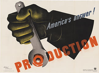
Carlu, Jean. "America's Answer! Production". 1942. Lithograph Poster. The Vintage Poster, https://www.thevintageposter.com/poster-detail/?inv=9517
Jean Carlu was known most for his advertising posters during the Art Deco time period and during and after WW2. Before designing, Jean had been an architect but after a freak accident turned to design where he used his past experiences and created work that was modern, clean, and geometrical/architectural. His work is not as glamorous but fits the period in terms of color and overall advertisement aspects within Art Deco. Being somewhat to the point, his messages are enhanced with different colored typography and illustrated objects. His work is different because of how there is a lot of angular motion going on within his work especially with "America's Answer!" Production. He includes a mix of illustrations in his words like the "O" of production and also in "Exposition..." there is layering and also diversity within the capital "E". I think his design is unique and important because of how he can connect with an average person and advertise something for anyone and everyone and not create an illustration that showed a luxury cruise/vacation or the best fashion of the 1920s/30s. He attacks more toward the working class in my opinion, especially in his work with WW2.
Comments
Post a Comment