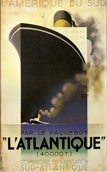
Example 2: "L'Atlantique"
Cassandre, A. M. "L'Atlantique". (1931). Poster. Alliance Graphique, Paris. Poster Auctions International, Inc., https://auctions.posterauctions.com/lots/view/1-NSJ5E/latlantique-1931
The vintage and Parisian poster, "L'Atlantique" by A.M. Cassandre (1931) fits the theme of Art Deco as the piece represents the Industrial Era of the early 20th century with the steamships that were starting to be produced. The poster is also textured as well as mostly symmetrical and uses a flat representation of familiar illustrations known for the Art Deco style. The geometric shapes to create these illustrations are yet another part of the Art Deco style that is represented in this design. This poster is different from the previous one in terms of the use of simpler colors and also a vintage/weathered texture to the edges and background. It gives an older look rather than a crisper newer look like the previous, Chicago World's Fair example. One other difference is that this poster is less detailed in terms of less going on in the image yet both make sense for what they are portraying. The previous poster is sharing a place/event while this one is about technology and travel mixed together. Cassandre's work also includes inspiration from the Cubism style as well with the use of harder edges which is actually a small similarity to the previous poster as well. I think this image is important to me because of how the typography used is put in a strong hierarchy and is just as important in relation to the images to portray an important message. I also find it interesting how the Industrial Era is so pronounced within this time period and how posters and ads for this topic were decorative, creative, and eye-catching.


Comments
Post a Comment