Example 19: Hotel Metro Milwaukee (Branding)


Burge, Brooke Craft&Co. Hotel Metro - Branding. 2021. Branding. Behance, https://www.behance.net/gallery/96827187/Hotel-Metro-Branding
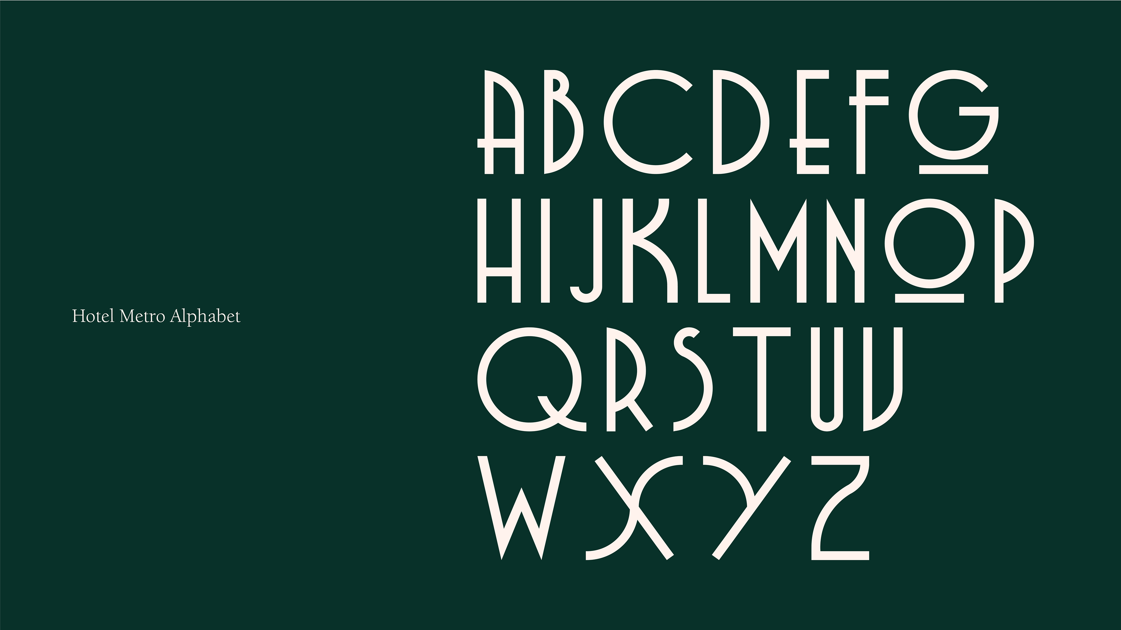
Hotel Metro-Milwaukee has a lot of interesting history which was a huge starting point and inspiration to designer, Brooke Burge's rebranding. She is located on Behance.com and showcases her design from the logo to the alphabet to the website and to the hotel accessories. She keeps the modern version of Art Deco in mind using mainly dark colors in the background as well as a lot of negative space but uses brighter colored geometric text that creates immense contrast. The simple design is mainly text-based but there is a classic feel about this that makes the hotel seem upscale and classy which fits right in with Art Deco. The typography shown in one of the images above uses different proportions within the letters and the underlinings in the O and G add to the geometric design. The little stamp image and the image of the hotel that are both outlined also have a geometric-type design that simultaneously pays homage to the hotel's history. I think this is diverse from previous examples because how this is a rebranding and not just a packaging design like the tea brand. The tea brand was also more bright and pastel-like in colors and used more detailed geometric shapes/patterns. I find this example important because typography as a large use of branding can be beneficial, simple, yet elegant, and using an Art Deco style, adds to the glamourous, vintage feel of the hotel.


Comments
Post a Comment